8 years of experience specializing in Fashion and Luxury Direct-To-Consumer (DTC) e-Commerce Design
Visit My New UX Portfolio at https://uxfol.io/jilenej

View New UX Portfolio - Last Updated February 2025
The Storied Life
~ Created in Wordpress plugin SeedPro
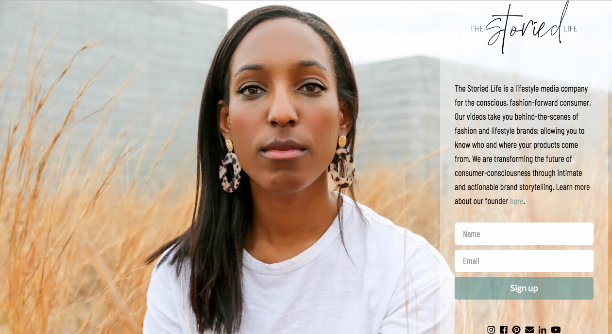
~ Created in Wordpress, edited in Lightroom, light backend HTML coding, UX/UI navigation, SEO work


CREATE a plan for your app. The format is up to you (e.g. presentation, video, document, etc.), but be creative and think digital-first. You will be judged on the originality of the idea, its innovation, and the scale of its impact. To give us a full picture of your app, please include the following:
CONCEPT: Explain the problem
SWOT ANALYSIS: Map the Strengths, Weaknesses, Opportunities, and Threats (i.e. limitations) of your app to demonstrate the feasibility and uniqueness of your idea
SUBMIT your entry. All entries will be evaluated and, from a shortlist, a winner will be selected by our all-star judging panel of Fashion and Technology experts from across the globe.
~ Created in Photoshop, Canva & Figma


*Tap and swipe left on images to view photos individually from a mobile devices
General Assembly
General Assembly school offers programs in web development, data science and analysis, user experience design, digital marketing, product management, and more. Students can choose from a range of formats and modalities to help them best achieve their goals, including full-time, part-time,
VISUAL DESIGN 8-WEEK PART-TIME COURSE Applies Photoshop, Illustrator, and Sketch's powerful functions to digital product design and UX design.
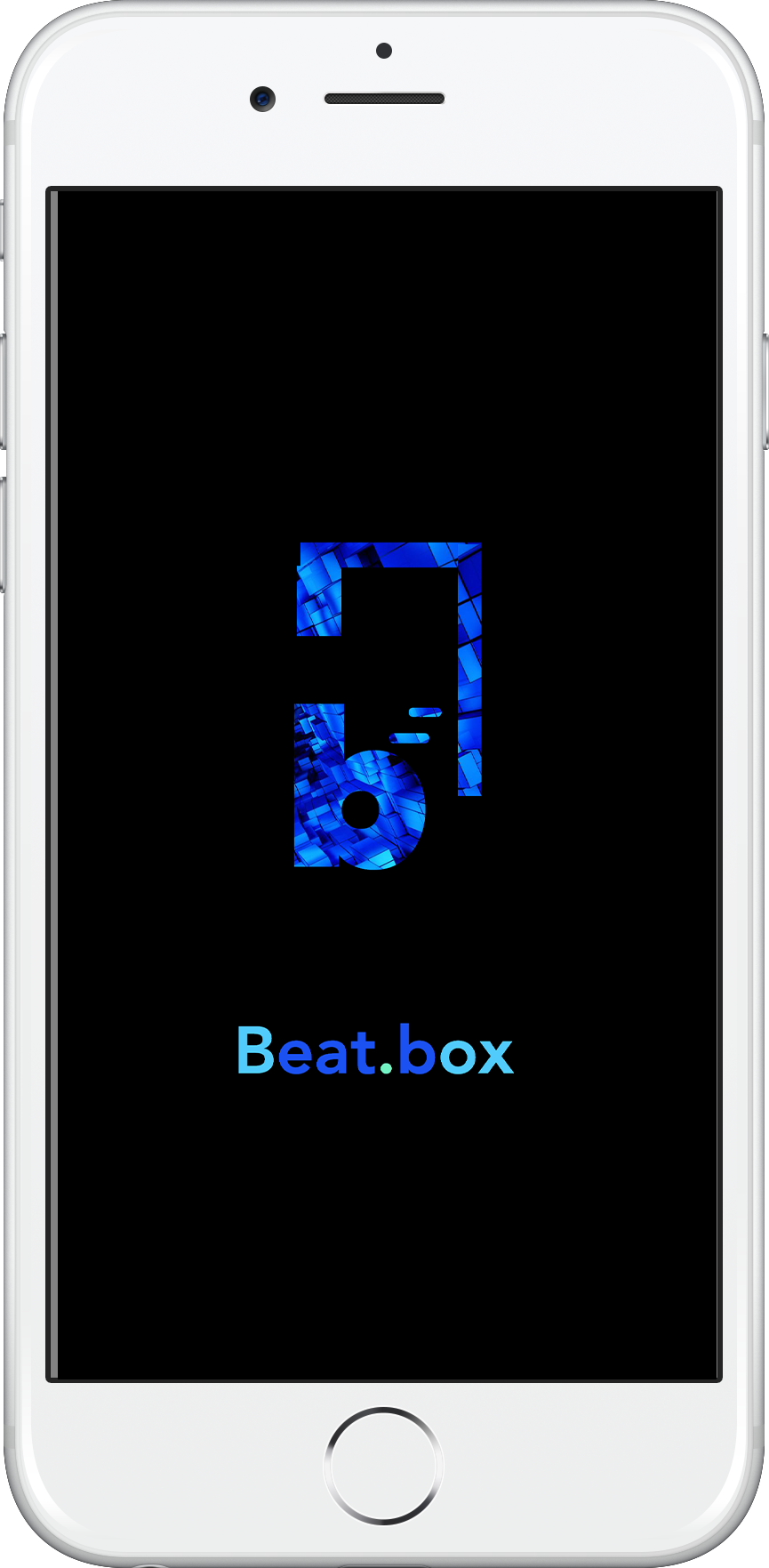
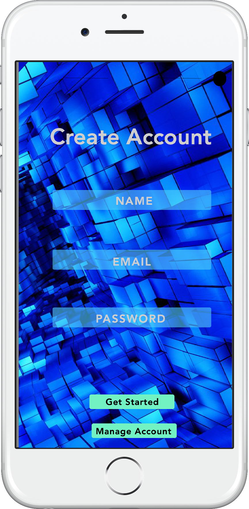
Final Class Project: Beat.box
THE ASSIGNMENT
Create a single “long-scroll”style landing page for Beat.box, using the provided content. You may edit the content as you see fit in order to create the most effective design.
ABOUT THE COMPANY
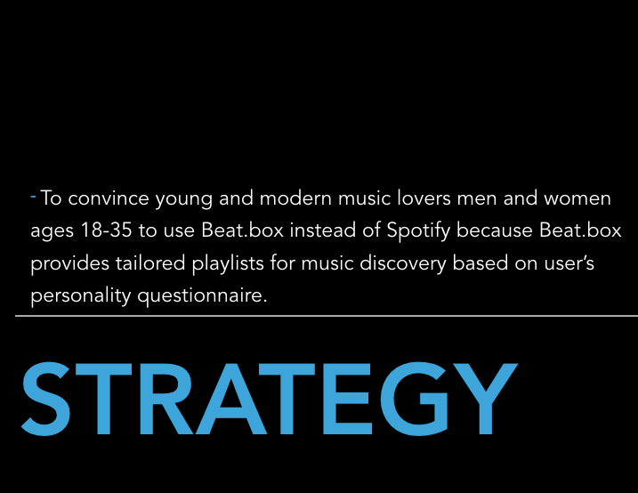
Beat.box is a new and exciting startup that offers curated music playlists to their users. Beat.box
produces a playlist based on a questionnaire the user answers when they create an account.
Beat.box is entering a market dominated by products like Spotify, GooglePlay, Pandora and SoundCloud
but with a unique perspective offered to their users.
Create a single “long-scroll”style landing page for Beat.box, using the provided content. You may edit the content as you see fit in order to create the most effective design.
ABOUT THE COMPANY
Beat.box is a new and exciting startup that offers curated music playlists to their users. Beat.box
produces a playlist based on a questionnaire the user answers when they create an account.
Beat.box is entering a market dominated by products like Spotify, GooglePlay, Pandora and SoundCloud
but with a unique perspective offered to their users.
Presentation
Keynote or Power Point Presentation due in class April 27th 2019.
Keynote or Power Point Presentation due in class April 27th 2019.
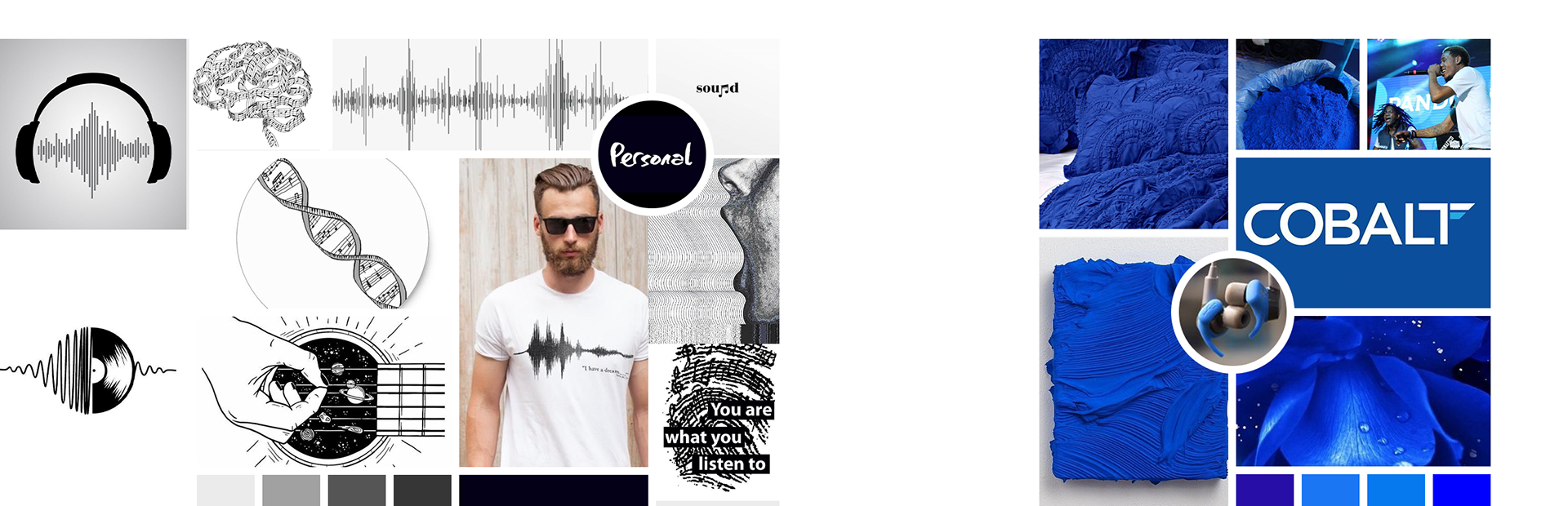
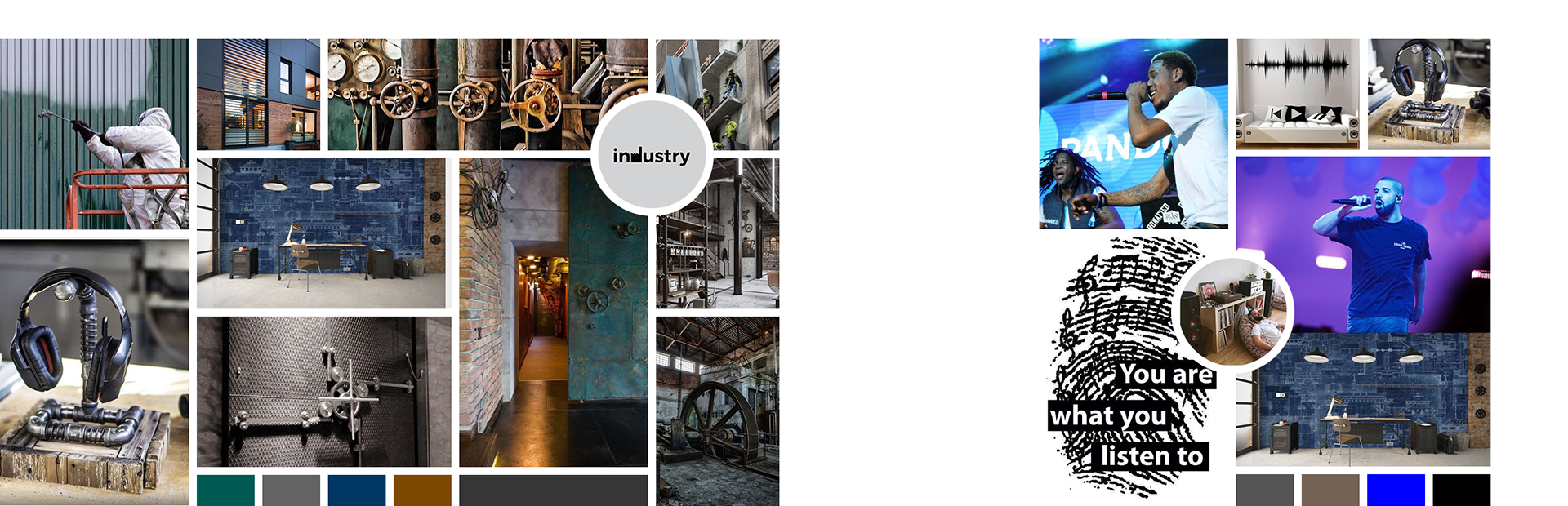
Mood Boards
Include at least 12 images in each mood board.
Use whichever design program you prefer: Photoshop, Sketch, or Illustrator.
You were randomly assigned a color.
You must work your color into one of your mood boards, either as a dominant color or as an accent color. It should be clear which mood board is using your assigned color.
~ Mood Boards created in Pinterest, Photoshop, and Adobe Color
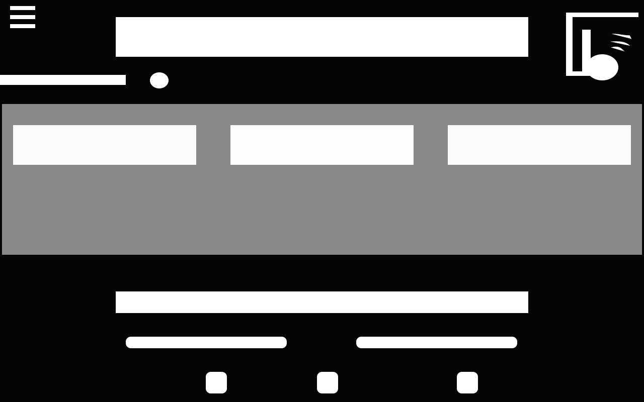
WireframE Sketches
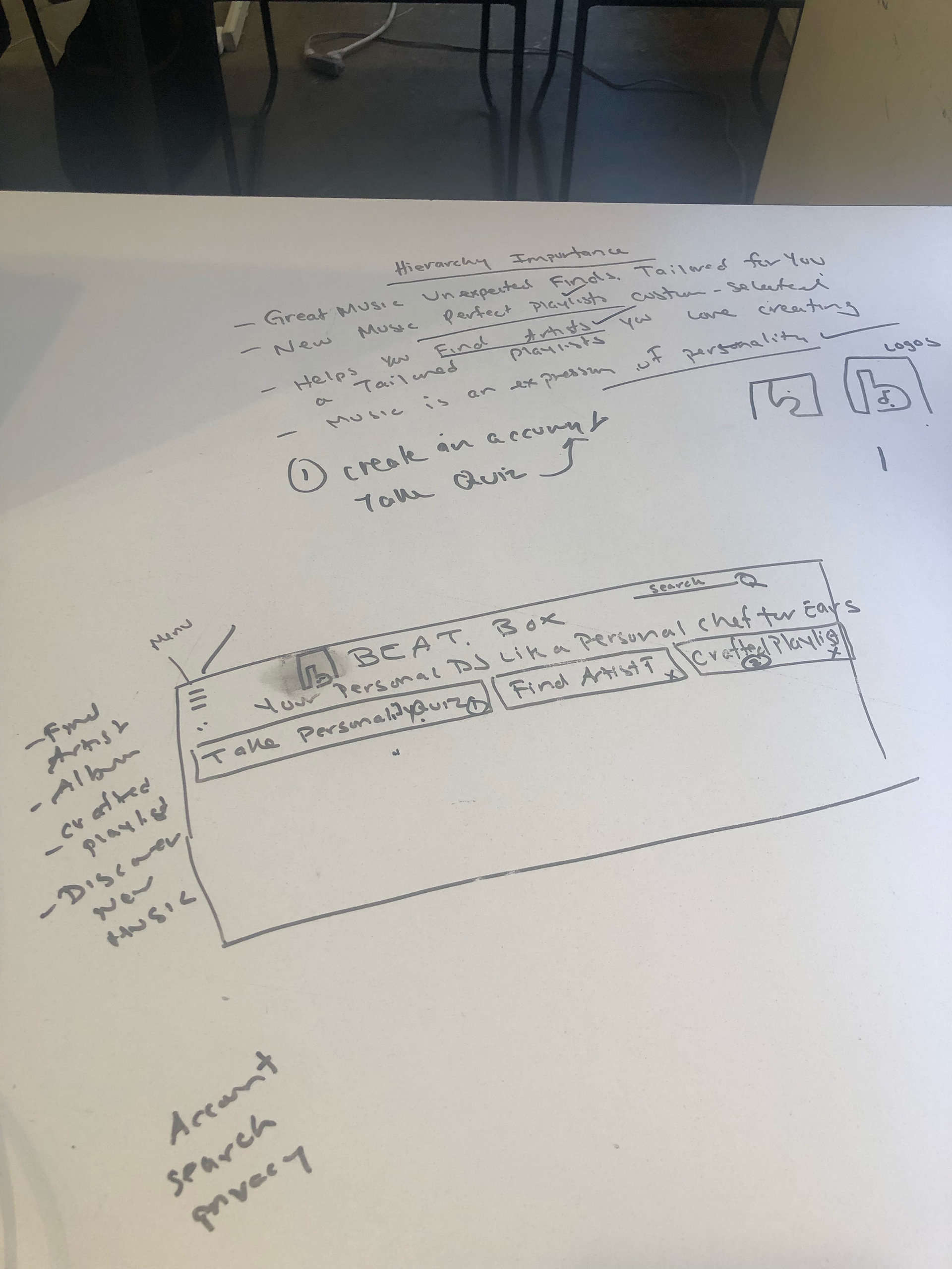
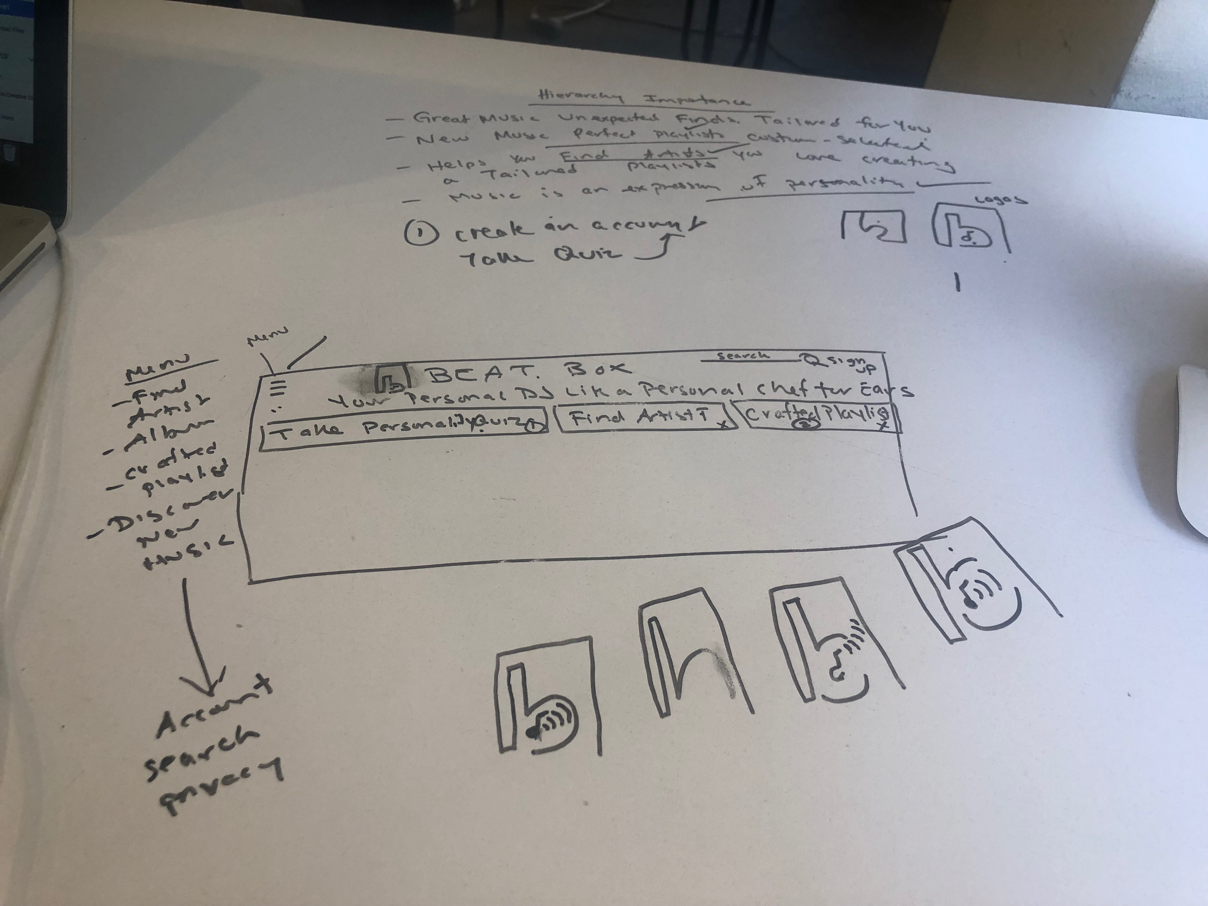
low-fidelity Wireframes
Create two different low-fidelity compositions that represents the provided content at a high-level.
Use only simple shapes: rectangles, ellipses, lines to represent the text, images and other content elements that will define your composition.
Use only black, white and one shade of gray.
Aim to demonstrate good contrast and gestalt. This assignment is about organizing information visually and creating a compelling layout.
~ Low-Fidelity Composition created in Photoshop
low-fidelity wireframes #1

low-fidelity wireframes #2
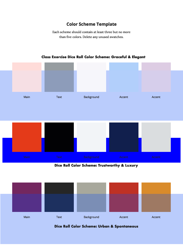
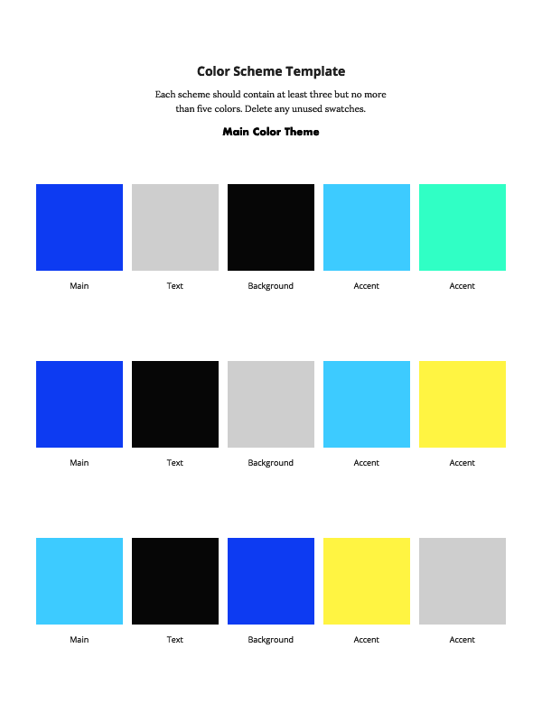
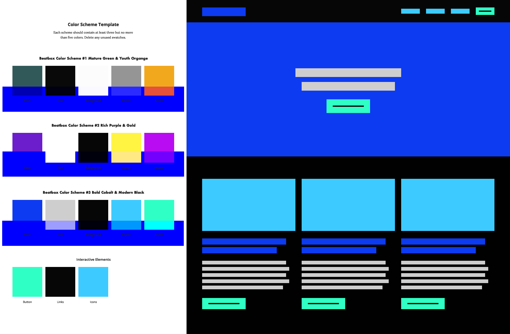
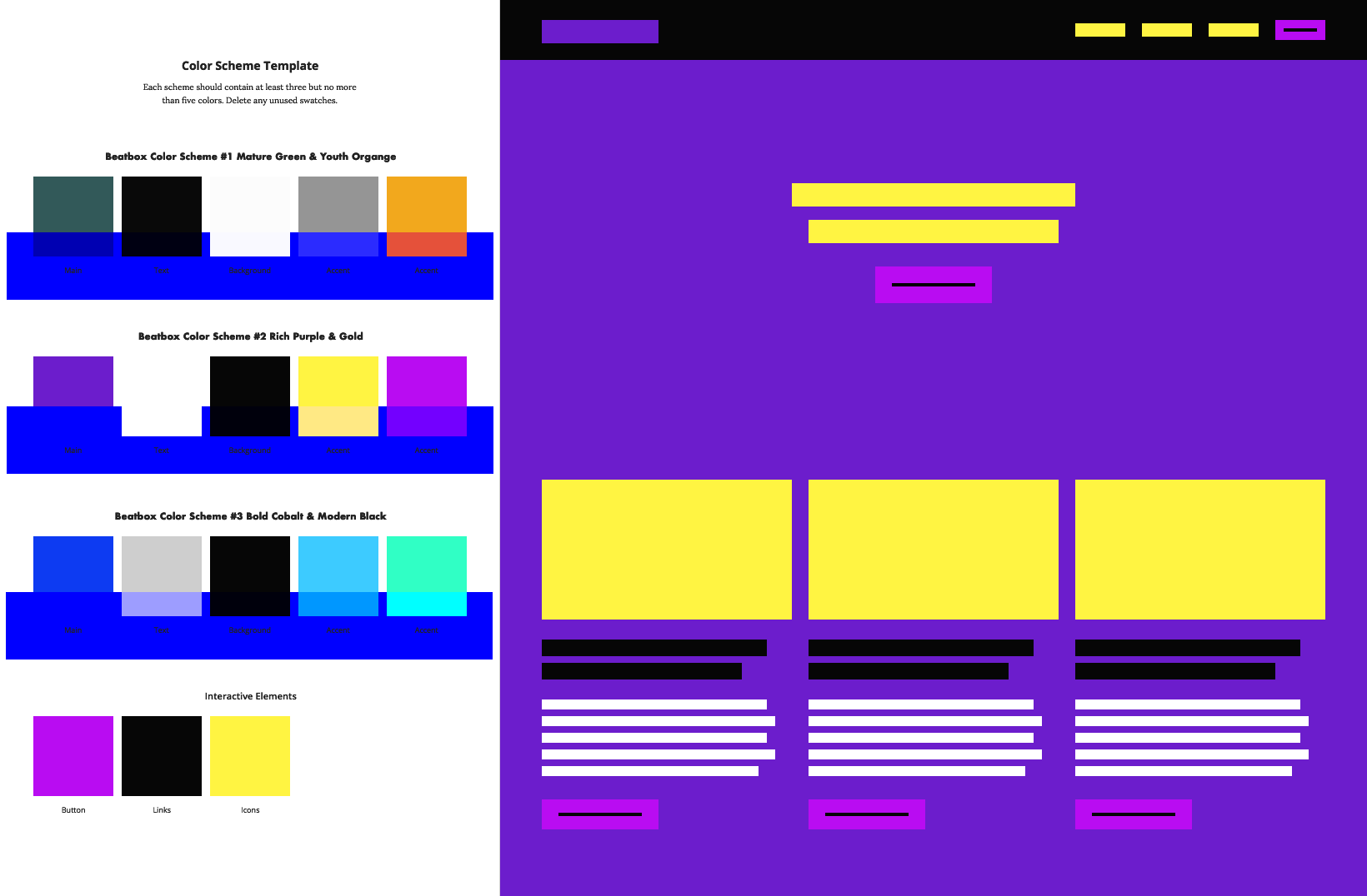
Color Schemes
Create a series of 6 color schemes. Each scheme may contain anywhere from three to five colors.
*Blue banner running across color swatches shows visual example of testing color swatches for three main types of color blindness : Tritanopia (Blue-Yellow Color Blindness) and Deuteranopia & Protanopia (Red-Green Color Blindness)
~ Color Schemes created using AdobeColor and Sketch
2 versions of Low-fidelity composition in Color
Pick two color schemes to test in your design by applying each of them to your low-fidelity composition. Aim to apply the color in such a way that it enhances the contrast and gestalt you achieved in the grayscale version.
Color Schemes created in Sketch
~ Low-Fidelity Compositions created in Photoshop
Low-fidelity composition in color #1
Low-fidelity wireframes in color #2
Final Project: Beat.box landing Page
~ Project completed using Photoshop, Sketch, inVision, Unsplash, AdobeColor, Keynote


DocASAP
~ Created in CANVA
DocASAP asked me to create a website UX/UI critique analysis case study for 3 websites
1. UX/UI Critique of DocASAP Client FPA Women’s Health Booking Appointment
2. UX/UI Critique of buoy: Buoyhealth.com Symptom Checker
3. UX/UI Critique of DocASAP website homepage

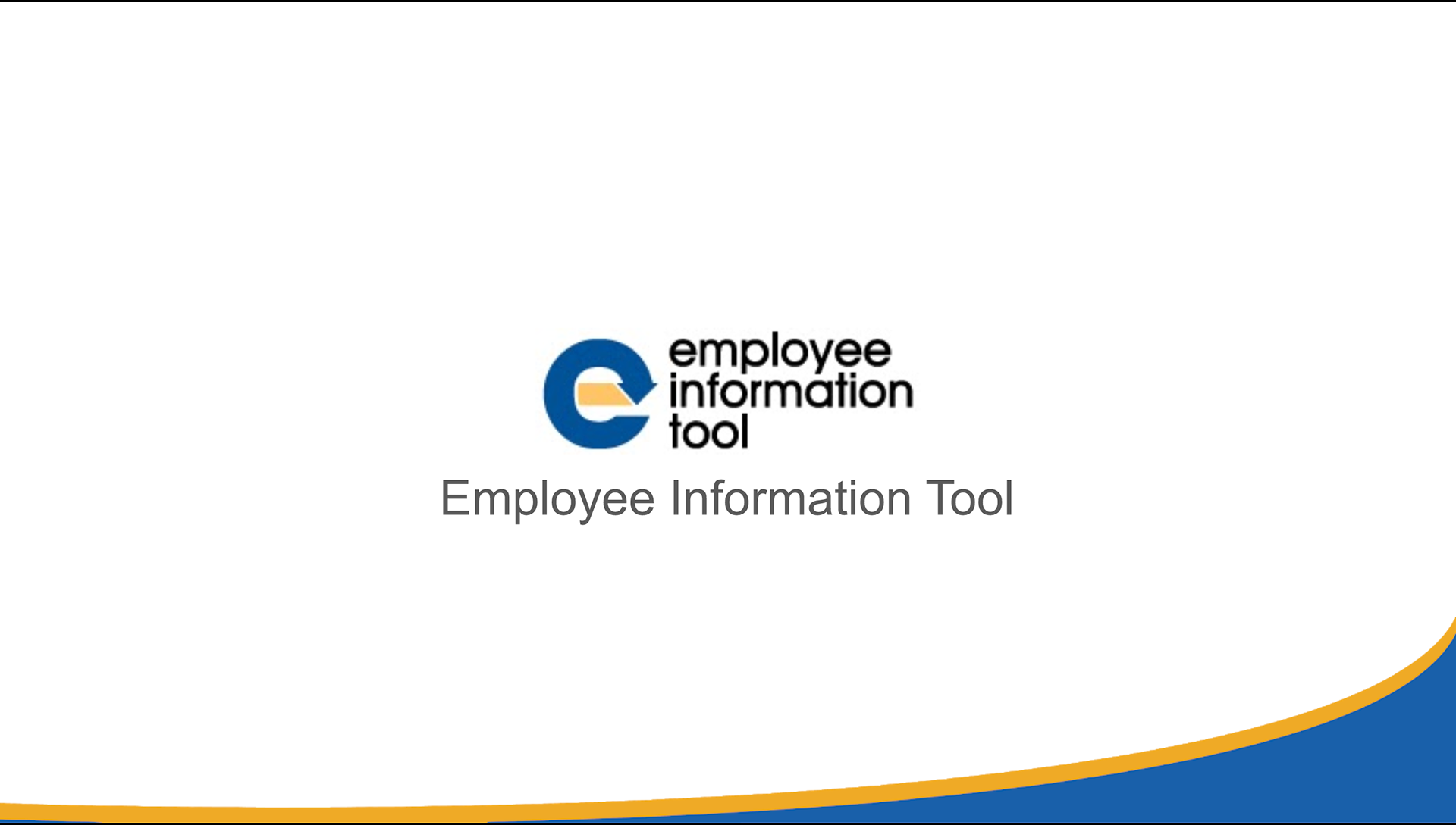
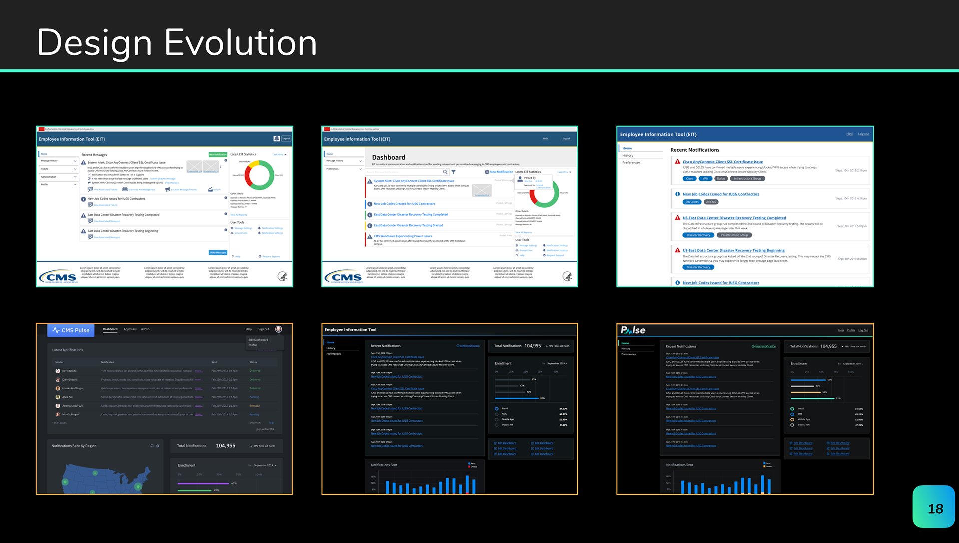
Working with the Centers for Medicare & Medicaid Services (CMS) to create a critical communications/notifications to be distributed to CMS employees called the Employee Information Tool (EIT).
As UX/UI designer my contributions are...
1. Leveraging Human-Centered Design (HCD) best practices in the redesign of the Employee Information Tool (EIT)
- To ensure and timely and effective information input and workflows into EIT that personalizes messaging relevant to CMS employees and meeting the 508 Compliance standards of:
- readability
- accessibility


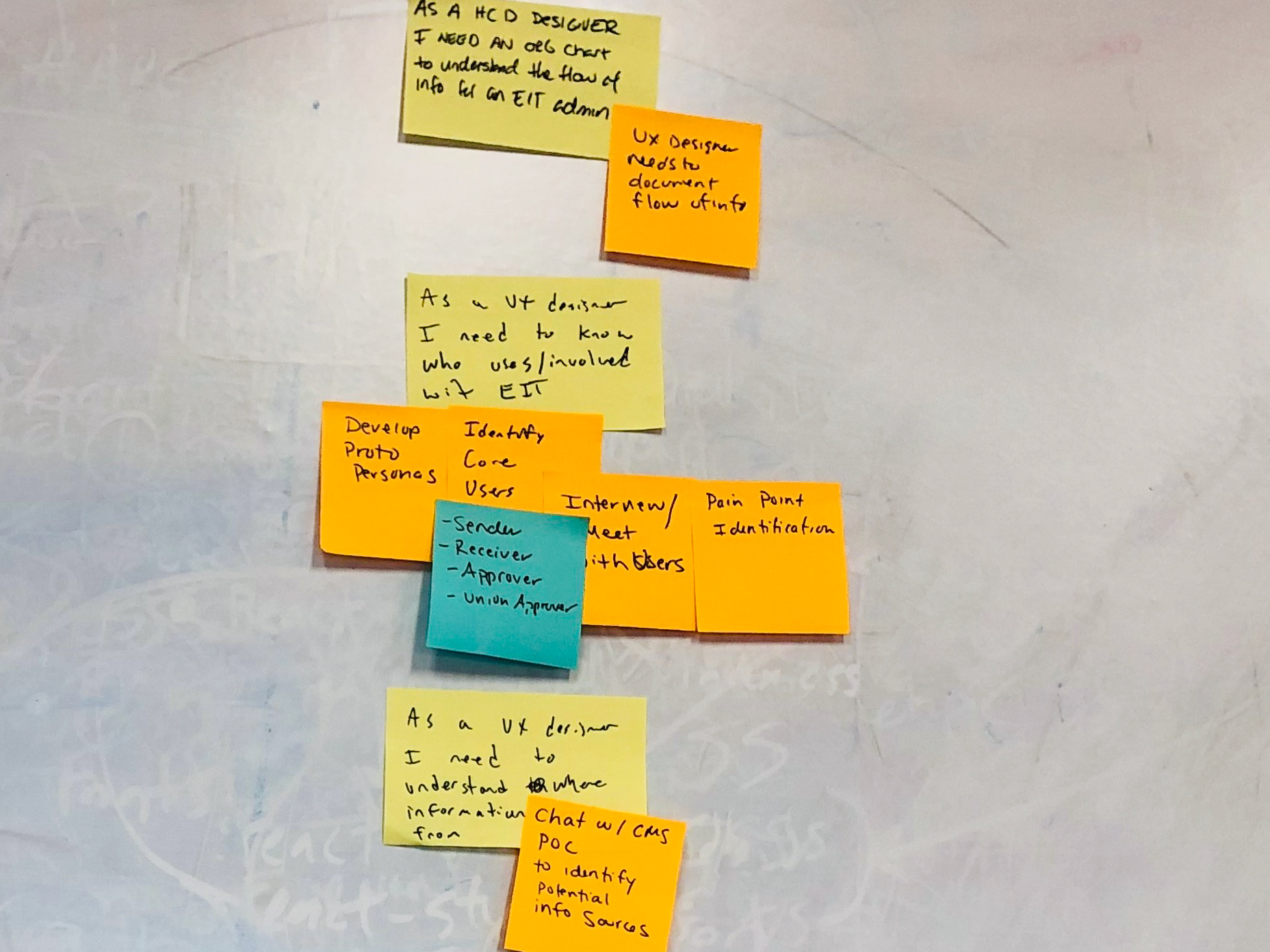
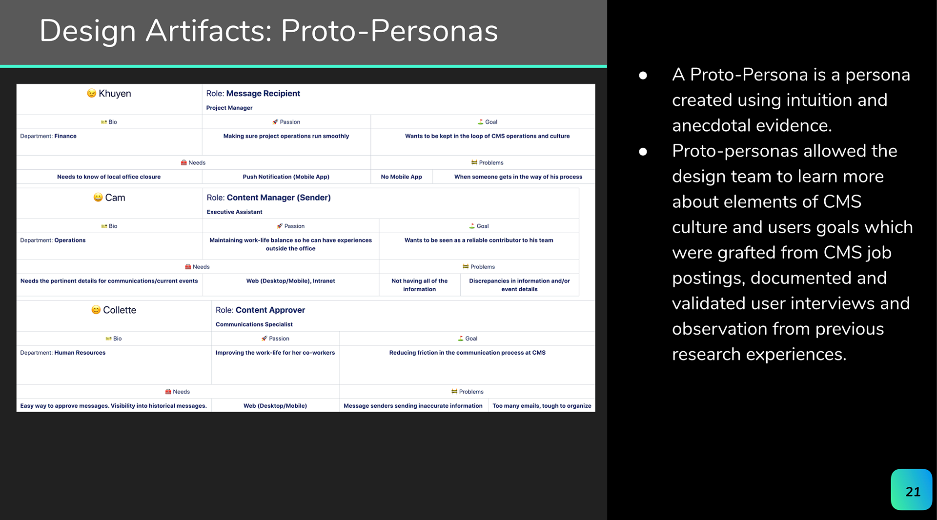
USER PROTO PERSONAS

JOURNEY MAPS

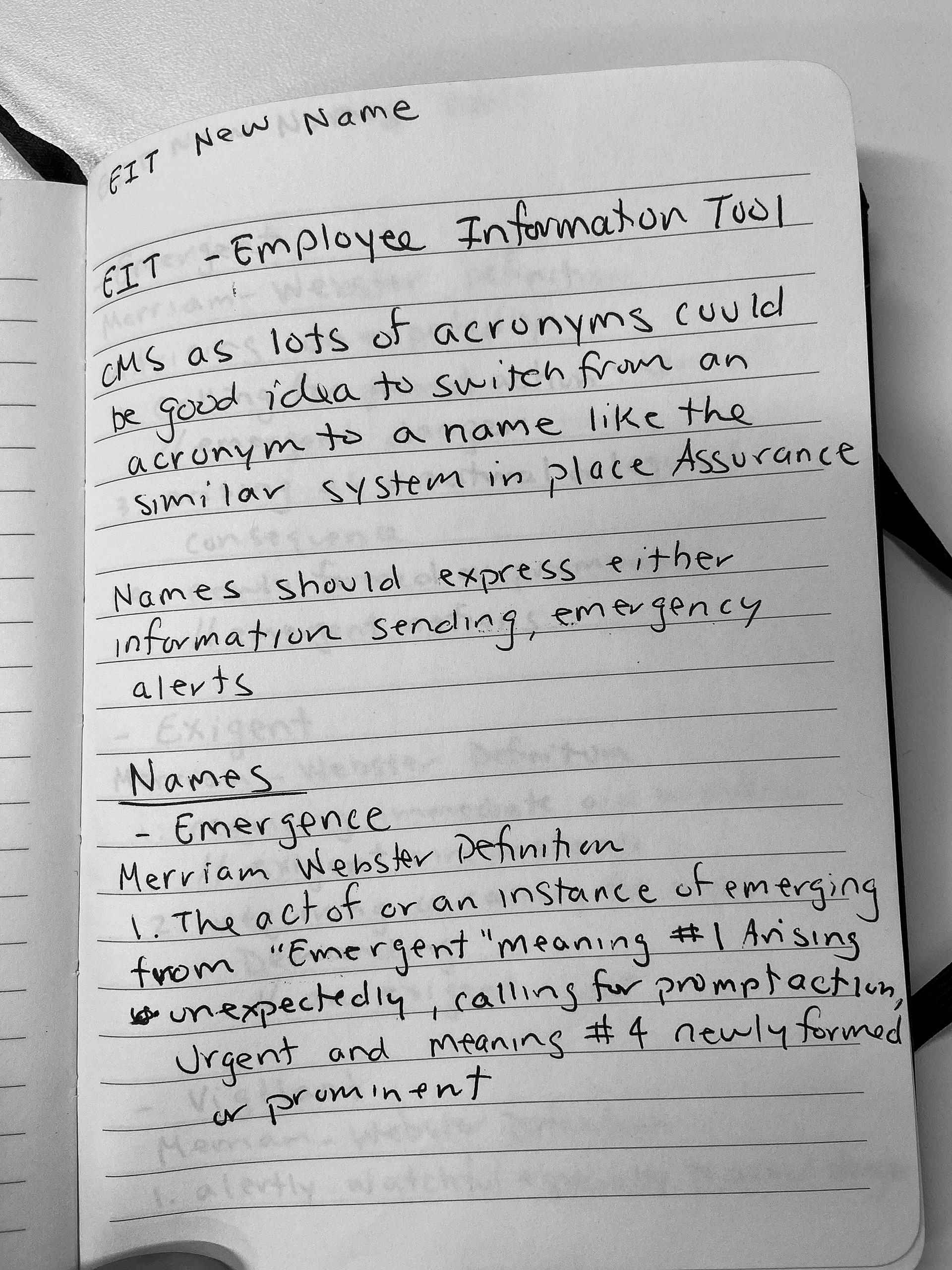
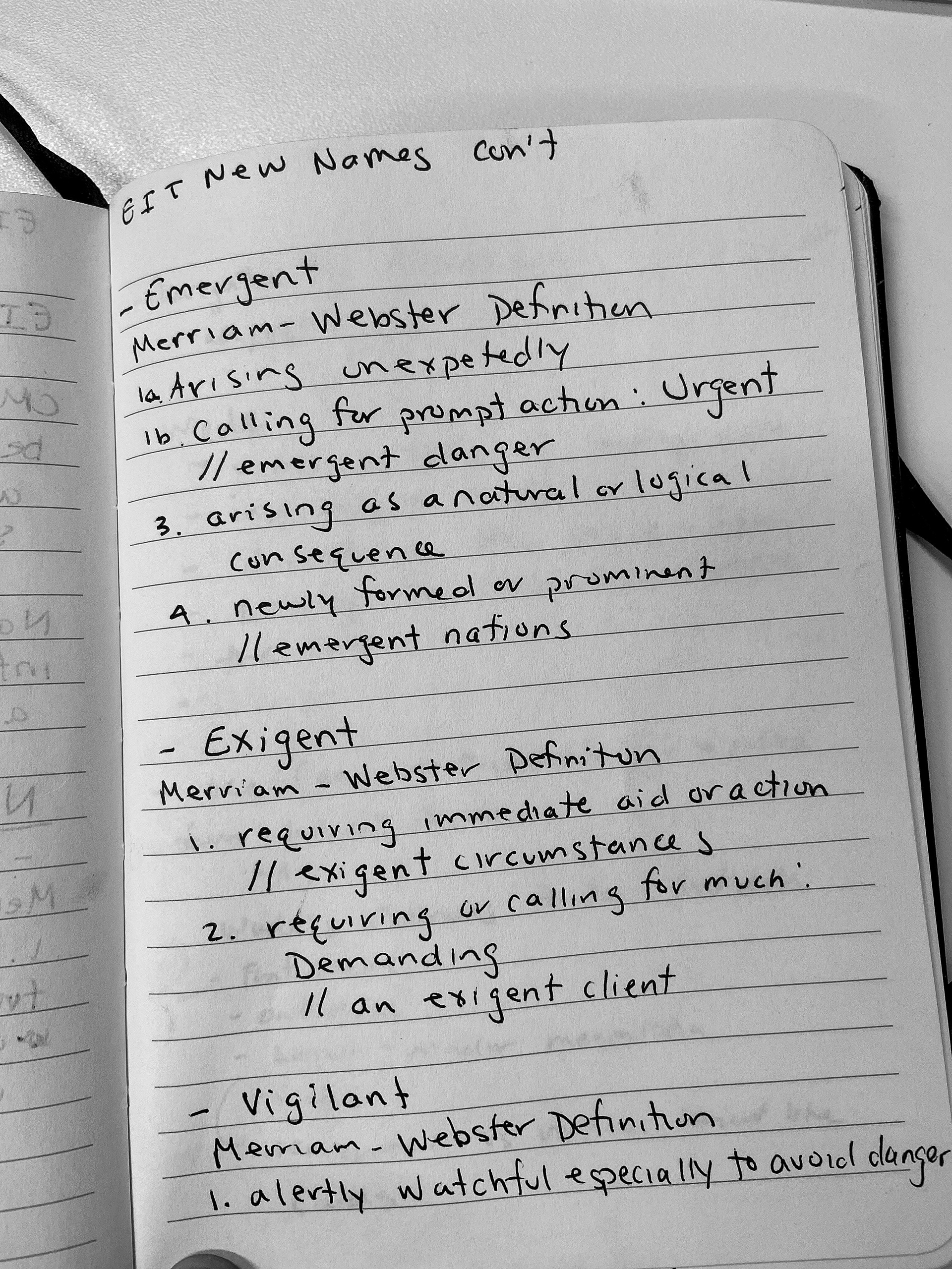
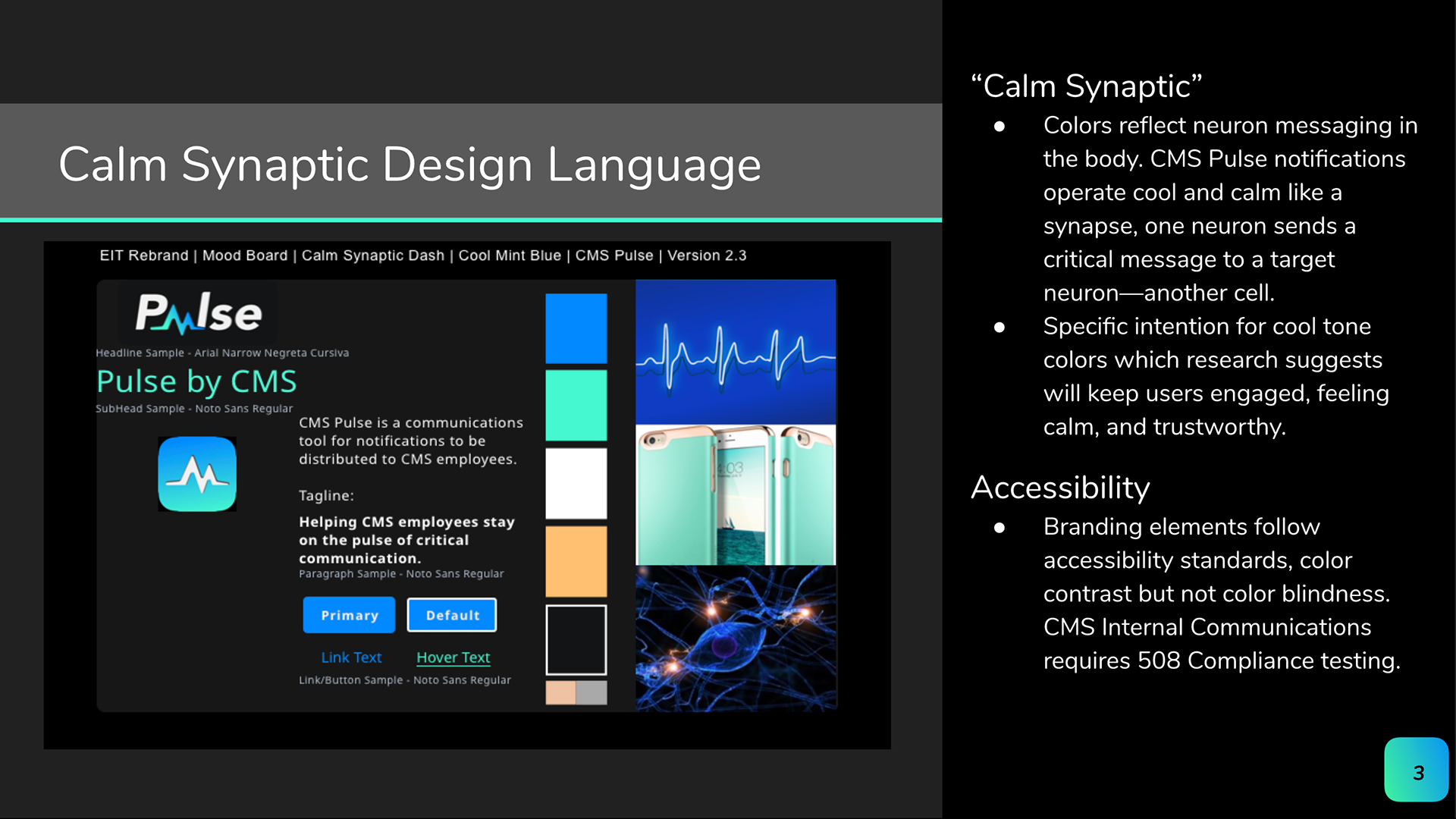
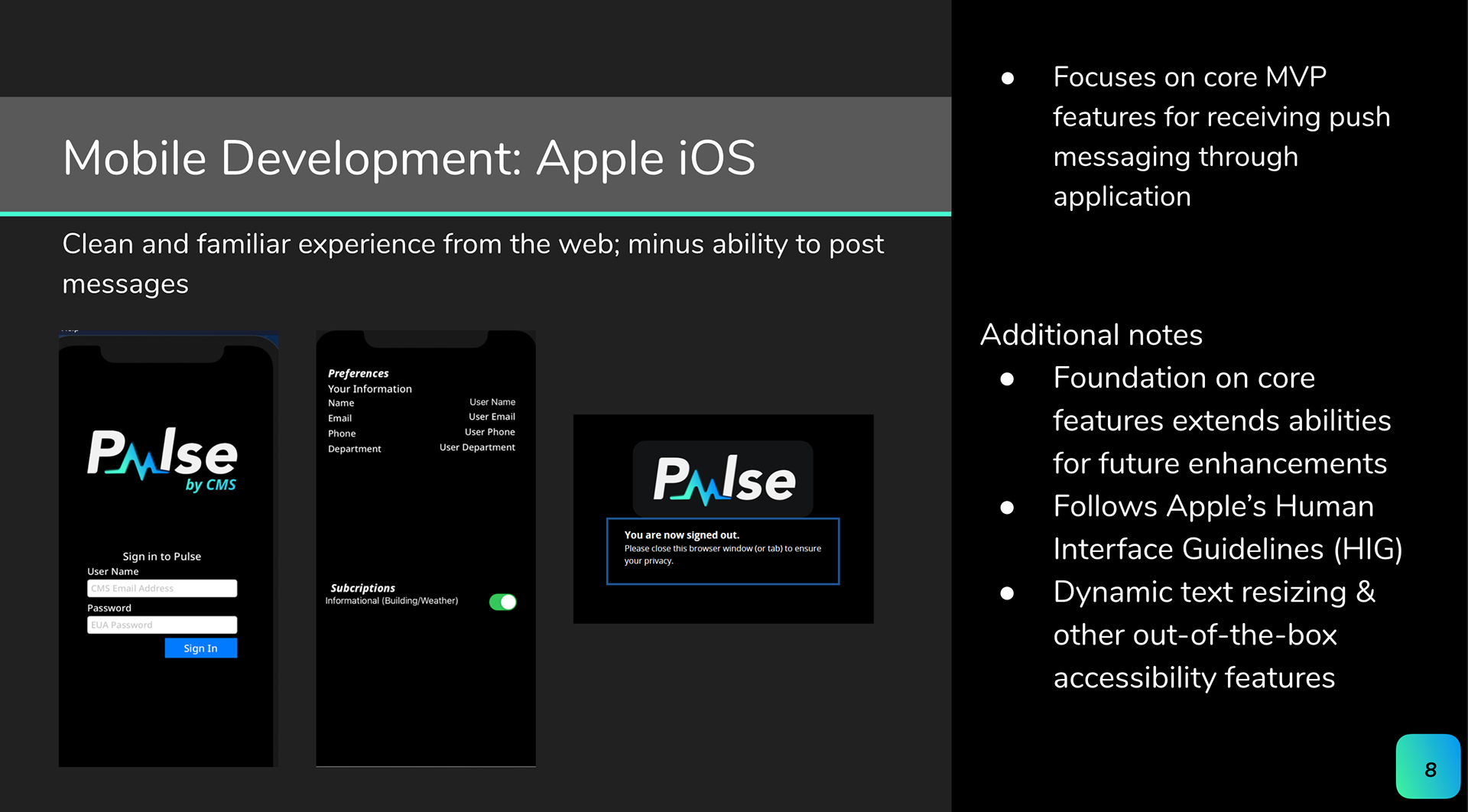
2. Creator of the Employee Information Tool (EIT) New Branding from EIT to PULSE for MVP direction and conceptual explorations of:
- Logo
- Naming
- Typography
- Color Palette: CALM SYNAPTIC/COOL MINT
- Features: Dark Mode as default view


3. MVP - PULSE MOBILE DARK MODE


4. MVP - PULSE WEB DASHBOARD DARK MODE
4. MVP FEATURE- PULSE CREATE NOTIFICATION WORKFLOW

The above screen displays the flow for a content administrator's web experience in creating a new notification to broadcast messages to a chosen audience.
User Story: As a UX/UI Designer, I want to improve the content administrator's experience in creating a new notification to broadcast messages to the chosen audience by iterating on Create Notification web wireframe.
Design Iteration Considerations/Acceptance Criteria
- Layout redesign
- Formatting menu tab
- Hint text above fields
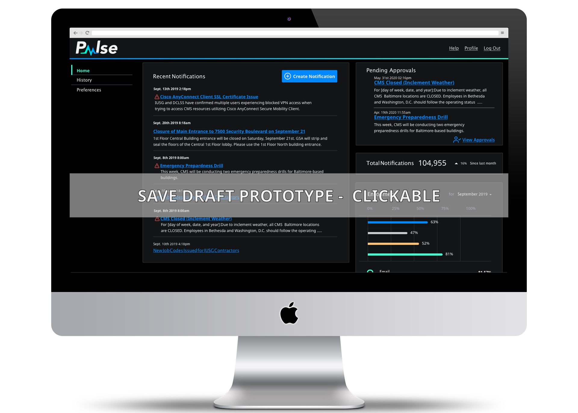
The above screen displays the flow for a content administrator's web experience in saving a broadcast as a draft for review and/or revision at a later time.
User Story- As a broadcaster, I want to have the ability to save a broadcast as a draft for review and/or revision at a later time (on Pulse web platform)
Design Iteration Considerations/Acceptance Criteria
- Ability to save a current broadcast and save a draft over numerous application sessions.
- Save draft button design
- Potential widget for saving draft
- Create a save draft widget that includes the ability for future approval workflow

The above screen displays the flow for a content approver's web experience in scheduling a future message to be published.
User Story - As a Content Manager or Approver I need the ability to schedule a future message to be broadcast
Design Iteration Considerations/Acceptance Criteria
- Content Manager or Content Approver is able to schedule a message to be sent at a future (only) date.
- Content Manager or Content Approver will be able to click the date and time field to which the message would be queued for future sending.
- Schedule Later button design
- Include the ability for Schedule Later button in the future approval workflow
- If a Content Manager creates a message for a future date, once completing the message composition and saving the message, the message will show on their message history screen with distinct styling (indicating that it has not yet been published)
- If a Content Approver changes or approves a message for a future date, once approving the message, the message will show on their message history screen w/distinct styling (indicating that it has not yet been published)
Upon putting a future date/time to a message and saving the message, a success message will show on the screen following
5. MVP FEATURE- PULSE APPROVAL WORKFLOW

The following screens describe the flow for a content approver's web experience in reviewing and approving a notification.
User Story- As a UX Designer I need to iterate on previous approval workflow concept designs with updated Web UI that gives the ability for a content approver to review, approve or reject notifications with ability to send edits back to the creator within widget
Design Iteration Considerations/Acceptance Criteria
- Ability to approve a current notification utilizing a widget
- Approval process needs to be robust and flexible
- Multiple ways of approvals: Linear (chain), Parallel
- Varying number of approvers
- Creators see who needs to approve notification in the UI
- Creators add approver (s) in addition to the system ones
- Reject notifications with the ability to send edits back to the creator within the widget
- Increased pixel size of icons and consistent use of chosen status icon from the homepage and throughout approval workflow
- Status icons next to notification title
- Successful action designated by checkmark Alert Badge
- Create another drop-down menu to contain other the status of other approves and move from the middle of the widget to the bottom


Visit My New UX Portfolio https://uxfol.io/jilenej

View New UX Portfolio - Last Updated May 2021


